


Description:
Company dedicated to public works with a staff of 100 direct and indirect employees.
Goals:
- Corporate identity that transmits the entity of the company.
Results:
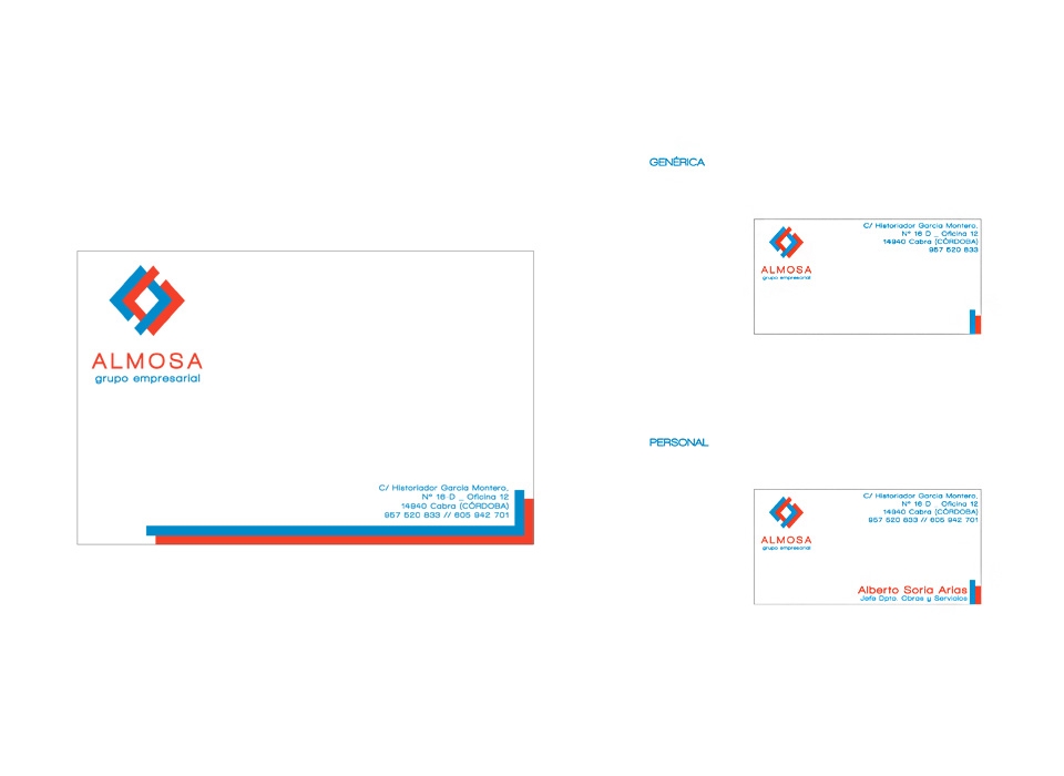
Corporate identity manual:
-
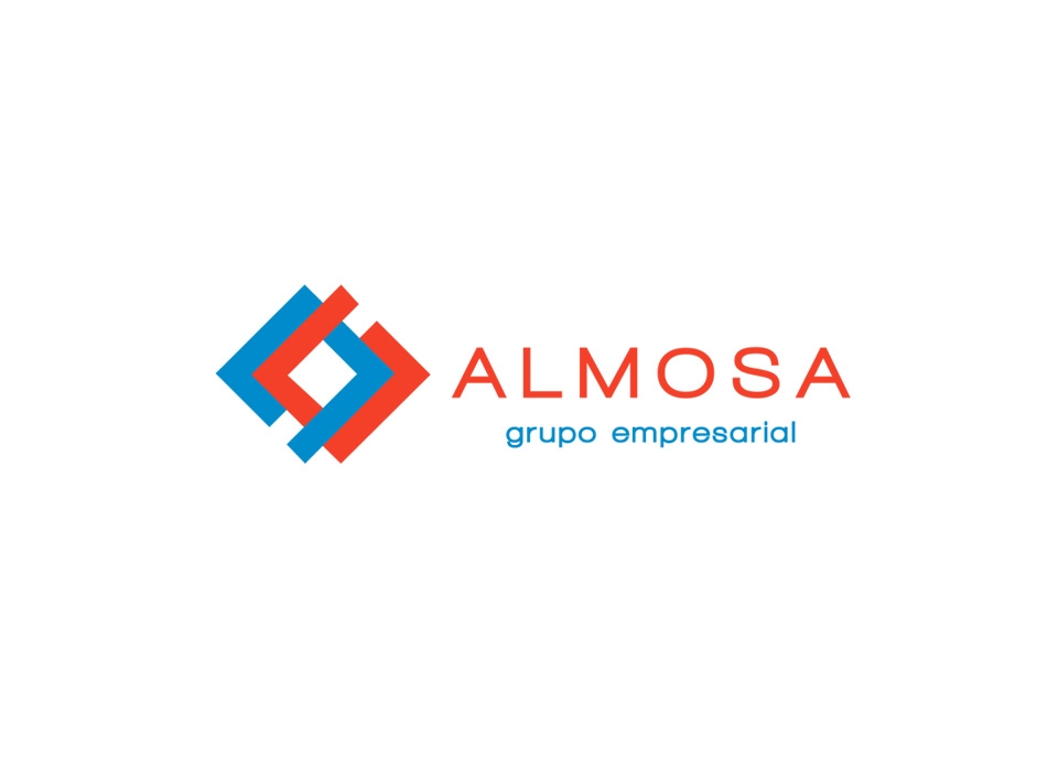
Brand: the brand designed for the multiservice company ALMOSA, represents the main ideas that you want to express, such as modernity, quality and innovation.
Composed by symbol and logo, it combines blue and red colors, colors quite associated with the company sector. These corporate colors can be replaced by white when the brand is printed on dark backgrounds or on one of the corporate colors.
-
Symbol: the graphic part of the brand is composed of two sets of geometric shapes, in the two corporate colors, linked, as an architectural structure or construction. The set of shapes are aligned squarely and symmetrically, creating a balance and giving elegance to the brand.
-
Logo: the textual part, consists of the name of the brand, "ALMOSA", and the nickname that designates the sector to which it belongs, "multiservice" (in certain cases it may be added to it, "constructions"). The typography used is characterized by a minimalist style typography and simple, without embellishments that hinder its readability. These are two types of dry stick or sans serif, the first of straight and angular strokes, which gives the brand solidity, stability and seriousness. And the second, with much softer and more rounded strokes that gives a touch of dynamism and modernity, creating a contrast with the first one that helps to attract the attention of the person who sees the brand, thus favoring its retentive memory. It is a modern and current typography, according to the forms of the symbol.