


Description:
Marcoluc, s.l. Company for the manufacture and marketing of modern line furniture. Heress manufactures and completes the furniture completely. Superior furniture, with more design.
Product mix: it is a modern product, all straight lines. Many colors, lacquered with brightness.
-
Lounges
-
Bedrooms (later).
-
Youth bedrooms.
Goals:
-
Communicate the entity and values of a new brand. Disseminate the brand and the company.
-
Image, idea or message to communicate: Modern design, Italian style. Straight lines. Entity, size, structure.
Results:
Corporate identity manual:
-
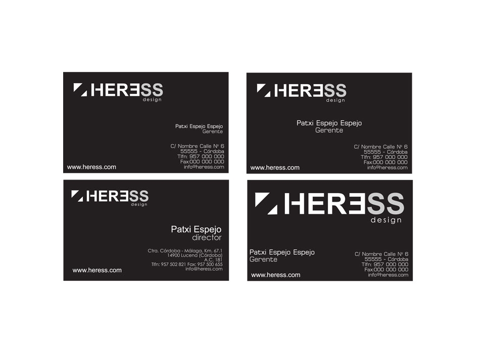
Symbol: The symbol (image associated with the name) that we have included to form the brand as a whole, is composed of simple forms, chasing an easy memorization in the least possible time and thus allowing to reinforce the identification of the company and differentiation by part of the possible clients. The symbol composed of two triangles, provides balance, design and innovation. A composition that perfectly complements the brand, standing out for its minimalism and simplicity.
-
Typographies: The brand consists of the words "Heress" and "design". The typeface used in the word "Heress" with a small opening in the horizontal line of the "H", divides it into two blocks to make it more singular and distinguishable. To further accentuate the impact of the brand, the word "design" has used a different typeface, in lower case, with much more rounded strokes, but in spite of that, simple lines and sans serif.
-
Colors: The colors used are black, white and silver. They are colors that evoke elegance and that above all confer the nuance of designer furniture.
We use a black background to highlight on this, in white, the name of the brand "Heress Design", creating a great visual contrast.
In addition, a touch of silver color has been included in the completion of the brand, specifically in the last two letters "SS", to give more emphasis to the peculiarity of the repetition of this letter facilitating and consolidating its memorization.
For the printing of the diffusion material included in this manual, some guidelines must be followed, which will be outlined below, so that this impression does not diminish brilliance, originality or style of the design of the "Heress" brand, but rather further enhance the brand.
A heavyweight paper should be used for printing. The black part must be printed with a matte finish and the mark with a satin finish. In addition to this, the symbol and the word design must have a relief on its surface. The two "SS" of "Heress" are printed in silver.
If these printing standards are respected, the result will be a brand with its own style, classy, elegant, bold and current, at the same time simple and easy to read and memorize.
-
Brand: The forms that make up this brand evoke the furniture of modernist aesthetics, characterized by the dispossession of the order in favor of perfection and simplicity. Specifically evokes a type of furniture consisting of modular structures, minimalist style, so successful today because of its functional character and elegant style. Mainly pure lines are used, under a geometric basis to relate the product with the concepts of modernity, elegance, solidity and durability. The Anglo-Saxon term "design" (design) has been added to the name of the brand with the aim of specifying the type of product we sell and in turn printing a touch of modernity, innovation and distinction to the brand.