


Musical instrument shop founded in 1998, in Talavera, by two young artists with a musical career.
With this project they seek to offer a better service to their customers by opening web site and updating their image.
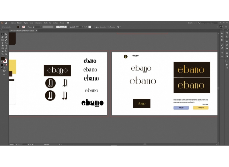
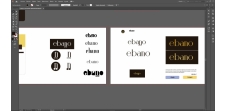
- Corporate image design:
We propose a traditional, professional and distinctive image using the historical references of each sector.
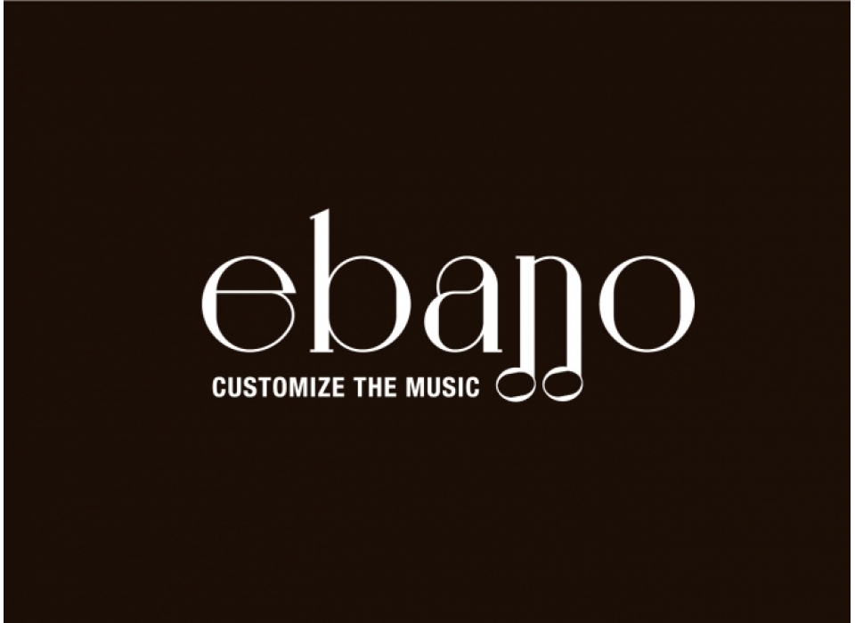
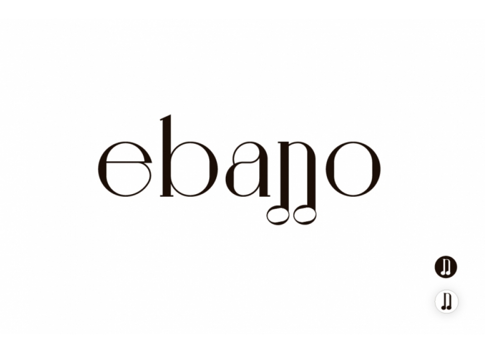
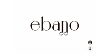
As experts in the sector and based on the roots of the great musicians, we developed a naming around this concept. Ebony. A dense wood, with deep roots, making a simile with music. In addition, this wood is used for the manufacture of instruments.
For the logotype we have used a typography with simple, straight lines but with fine, enveloping finishes that simulate the curvature of musical symbols such as the treble clef. The logo is built from the "n" with the addition of two musical heads to represent the musical note, the quaver. For reduced sizes a simplified version of the logo is used reducing it to the musical note.
- Corporate colours:
The main colour is refers to the name, a dark brown tone like wood, which brings seriousness and elegance. Yellow has been chosen as a complementary colour, a vibrant colour that together with the brown creates a good contrast.