


GECOR is a service that makes it possible to manage the maintenance of public spaces in a transversal way, integrating municipal technicians, managers, service companies and citizens. It establishes a multidirectional communication channel that facilitates a transparent and positive relationship between a municipality and its citizens for those who are committed to becoming a Smart City.
Concept
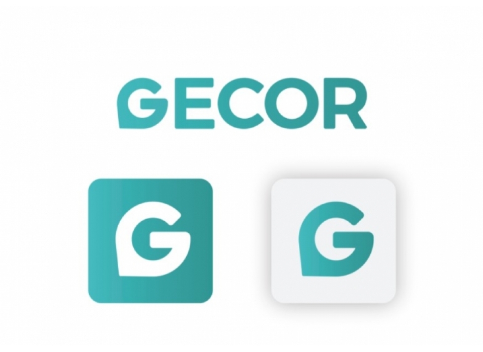
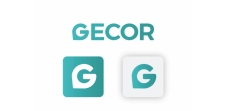
The brand is born thanks to the union of two very clear concepts. Firstly with the G we allude to the brand name: GECOR, and secondly we refer to the location with the geolocation indicator.
Development:
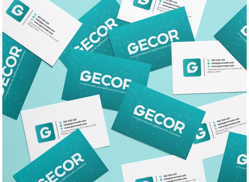
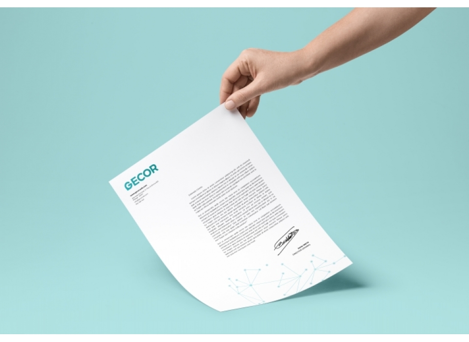
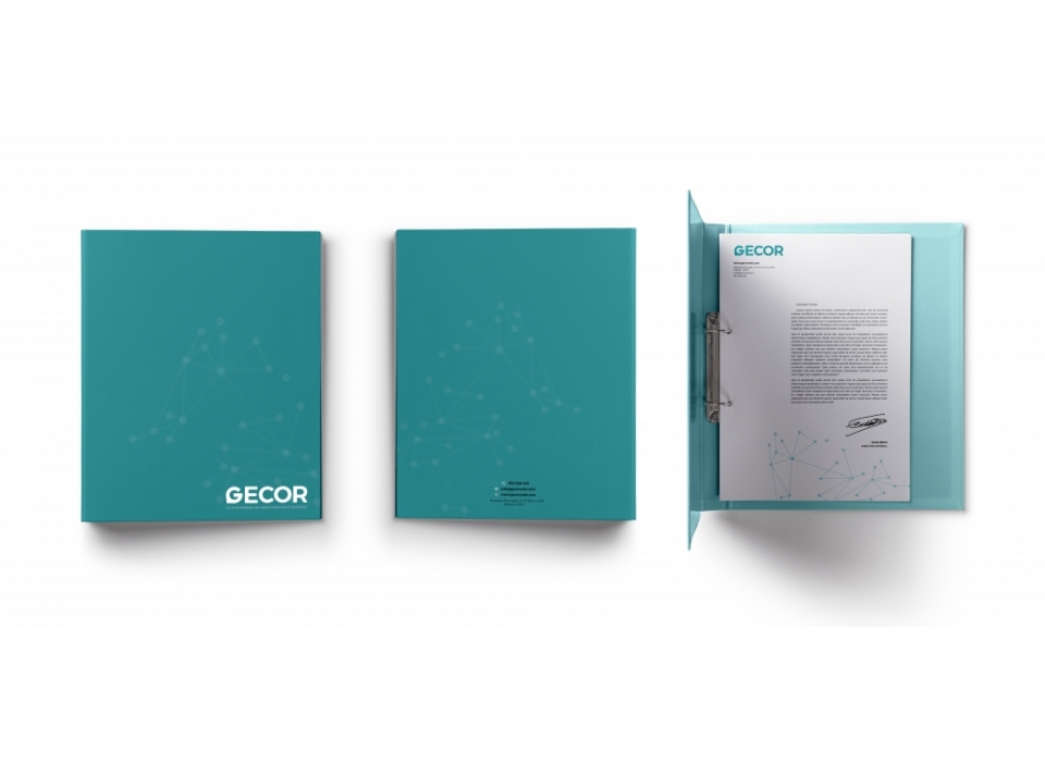
GECOR is a brand that has a positive and negative version, as well as a corporate colour, for its different and future applications. The colours must harmonise with each other. A main typography has been chosen for the construction of the brand and the different applications, the Montserrat typography in its different weights, perfect for representing values of modernity and technology.