


Description:
Hotel 4 * Benalmádena Palace, on the Costa del Sol, with 200 rooms.
Goals:
-
Redesign of corporate identity.
-
Design of a corporate identity manual.
-
Transmit a differentiating concept, since the current logo did not know what it meant and mixed several concepts with very little visibility and usefulness.
Results:
-
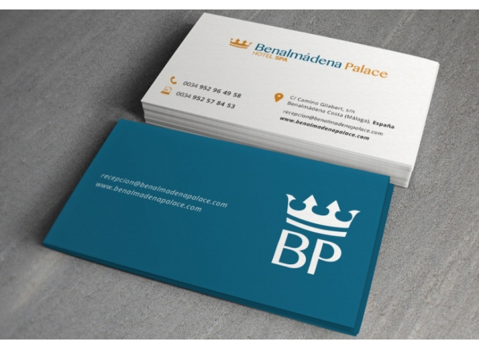
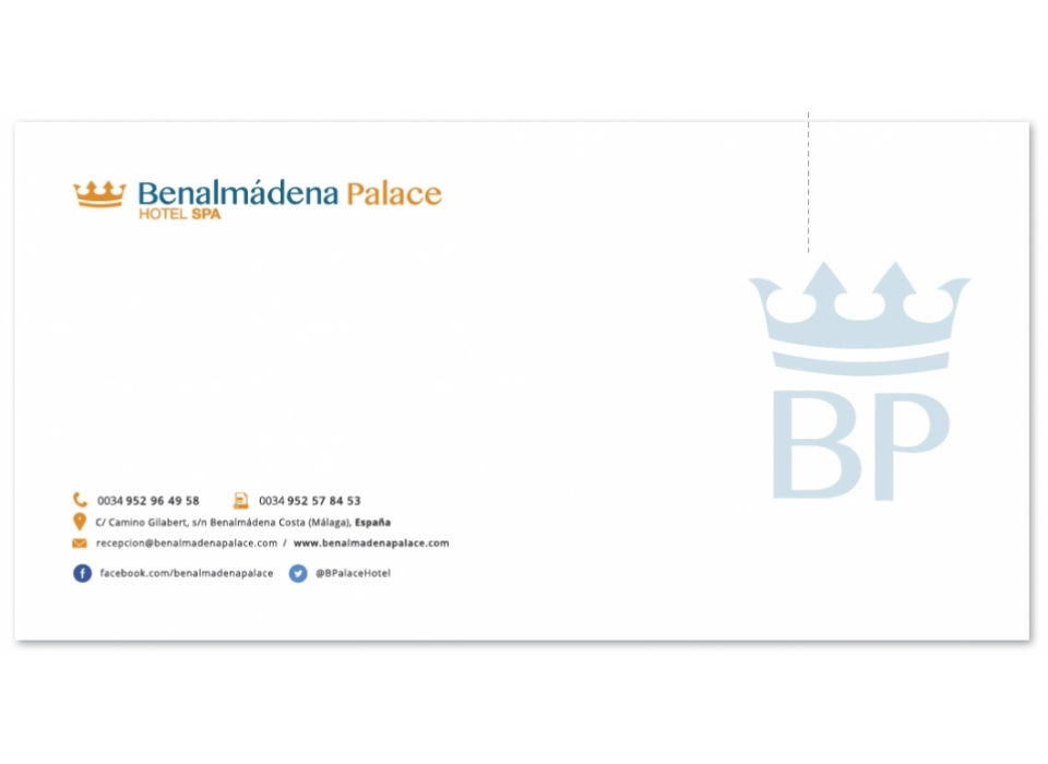
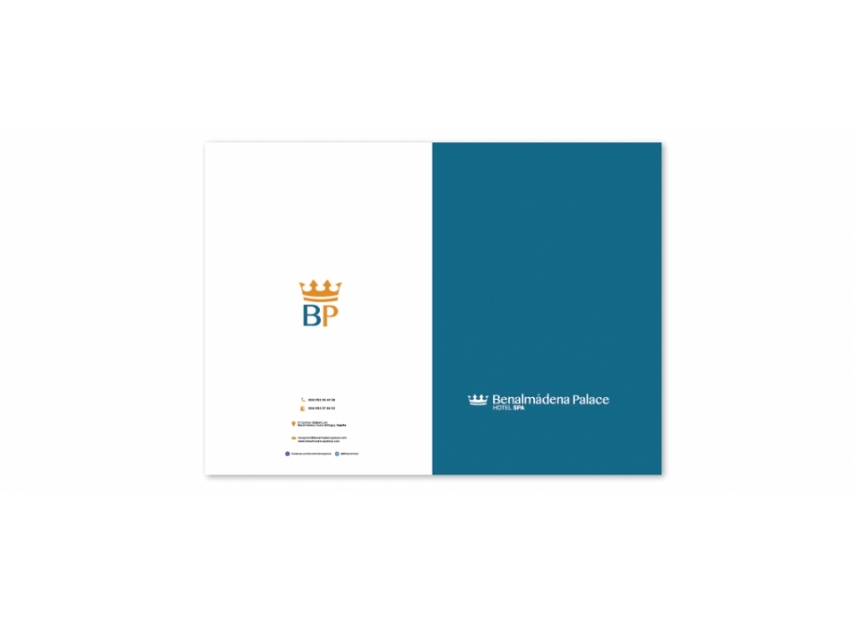
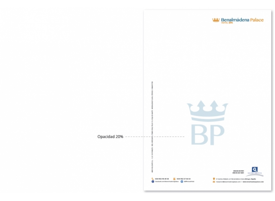
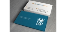
Corporate image with a defined concept reinforcing the Naming of the Benalmádena Palace Hotel. through the symbol of the crown.
-
Symbol: The brand uses the crown symbol, which represents "royalty".
-
Brand: We find a brand with a high textual component. It allows us to fully know the name of the brand and a small descriptor informs us of its nature. In turn, the description emphasizes "Spa", giving it greater relevance. Symbology brings to the whole the necessary balance and an intense meaning. The result is a brand with a clear declaration of intentions that reveals its location and the main activities that we can carry out. Using the aforementioned elements, together with the initials we obtain the condensed form of the brand, used as an alternative to the main one.
-
Corporate colors: Essentially, the chosen colors seek to reflect the ideas of water and sun. The blue tone with a greenish touch represents the water and especially the sea water. The yellow tone represents the sun but its orange appearance could also represent gold "the crown". We emphasize the ezul because next to white is the main application of color for the brand, relegating the yellow to a second place. It is recommended not to abuse the use of yellow.