


Description:
Prodigia Business Idea based on the Collaborative Economy, a new way to party, spend less and meet friends.
Objectives:
Namig, creation of company name and corporate identity design. Must convey the mission of the company and denote strong entity.
Result:
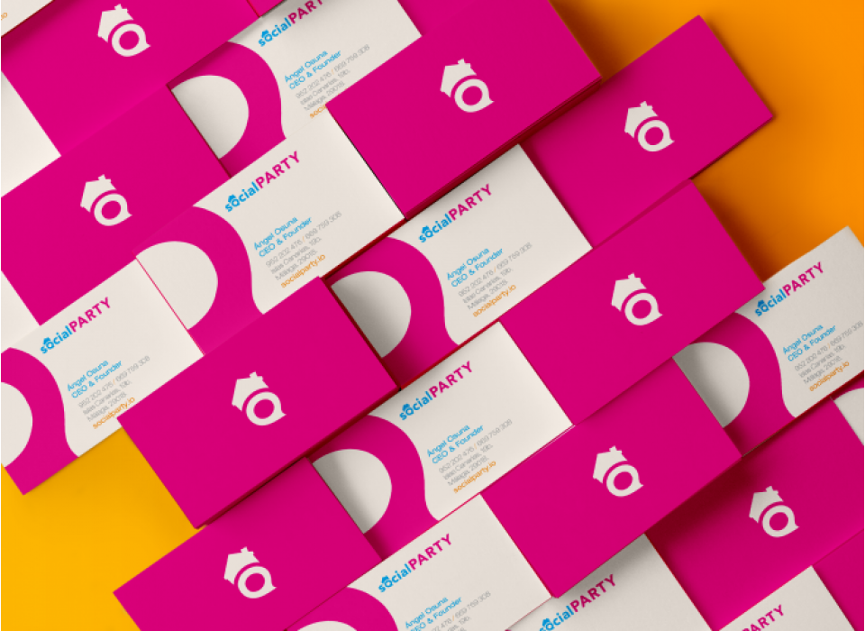
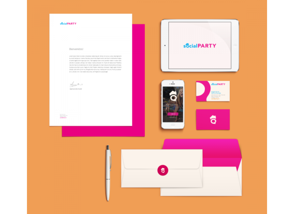
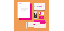
There are two colours that make up the brand. Fuchsia stands out, a colour that conveys friendship. It is an optimistic and daring colour, which has an impact on sociability. It also transmits accessibility to the product itself. On the other hand, blue gives us a touch of freshness and freedom, as well as security and confidence. Key concepts for a brand that moves away from the traditional. "Trust in new experiences".
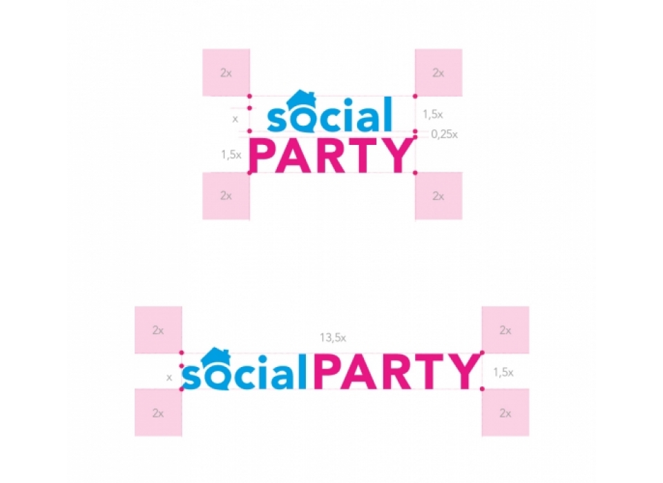
The typeface chosen was Avenir (classic style sans serif). With a jovial and casual character, it gives the brand a modern and fresh touch. Its great legibility means that the integrated logo can pass for an "o".
SOCIALPARTY is an original and differentiating naming, easy to read, and pronounced as a single word that conveys a group entity due to its strong sonority. It alludes to socialising and having fun, with its own identity creating a brand personality. It constitutes a corporate identity with a strong visual and auditory retentive impact on the brain. The symbol is a "Balloon/snack" representing conversation with a hat that simulates a house. The brand has optimal visibility even in tiny sizes for merchandising, both in terms of visual identification due to the colourful and originality of the symbol, as well as the easy legibility of the logo, which breathes perfectly due to its minimalism. We have managed to create a brand with impact, quality, visibility and perfect squareness and balance.