


Sortealis is a brand that offers the management and publication of sweepstakes for different sectors using social networks. An alternative as a solution to the new conditions imposed by the different existing platforms.
Concept:
The naming comes from the concept sweepstakes and luck linked to the medium and speed at which prizes are obtained, flying. Luck + Draw + Wings, SORTEALIS is born. A descriptive name that encompasses all the concepts in a single word, with sonority and retentiveness.
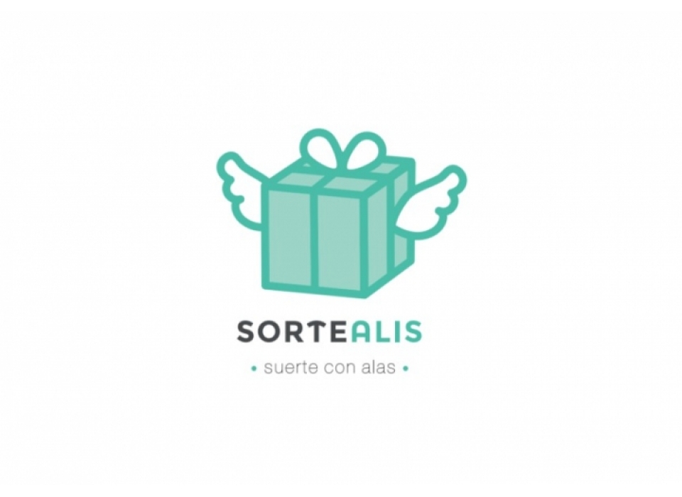
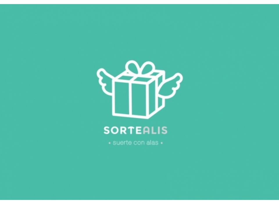
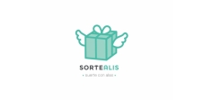
The Sortealis logo is a gift box with wings that could easily do without the naming in the future.
Typography:
For the nanming, Montserrat Alternates has been used in capitals, a casual, urban typeface with a straight cut and notable weight. In the brand descriptor a standard, minimalist and light weight font has been used to contrast with the main name.
Colour:
In addition to this, the psychological symbolism of green implies virtues such as novelty, social, confidence and success, all of which resonate with the brand identity.