


SOSparejas is a platform that arises to solve couple arguments. A place where couples can consult the collective intelligence to find out who is right in their arguments.
Objectives:
Namig and corporate identity design.
Result:
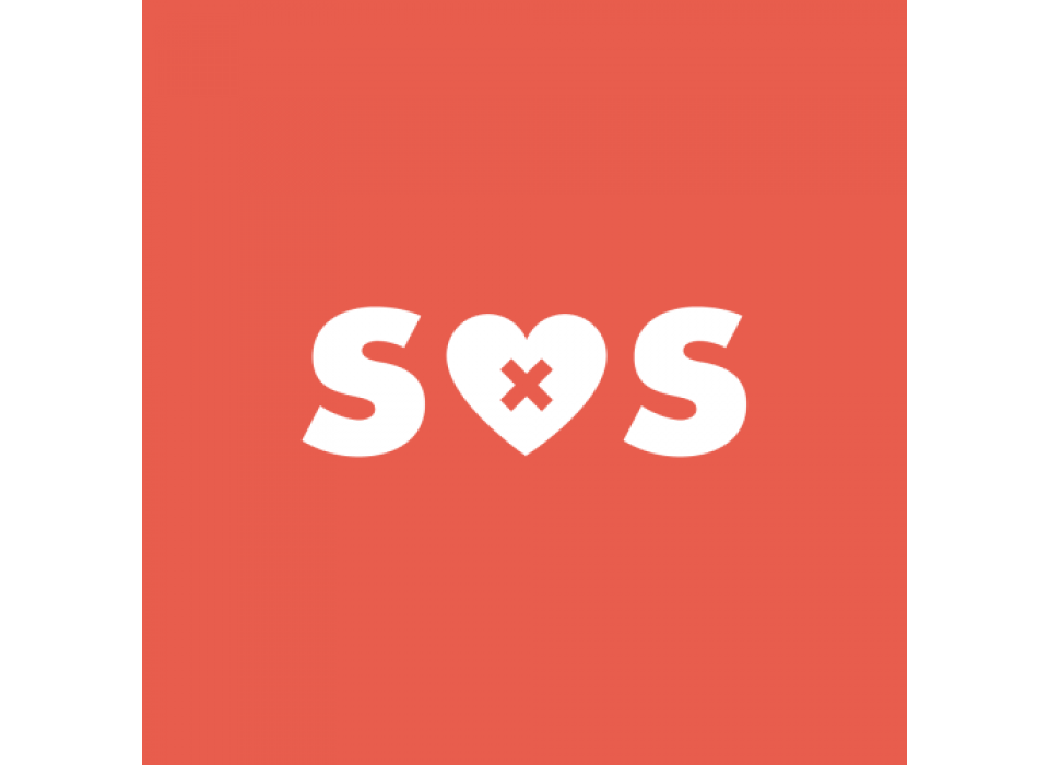
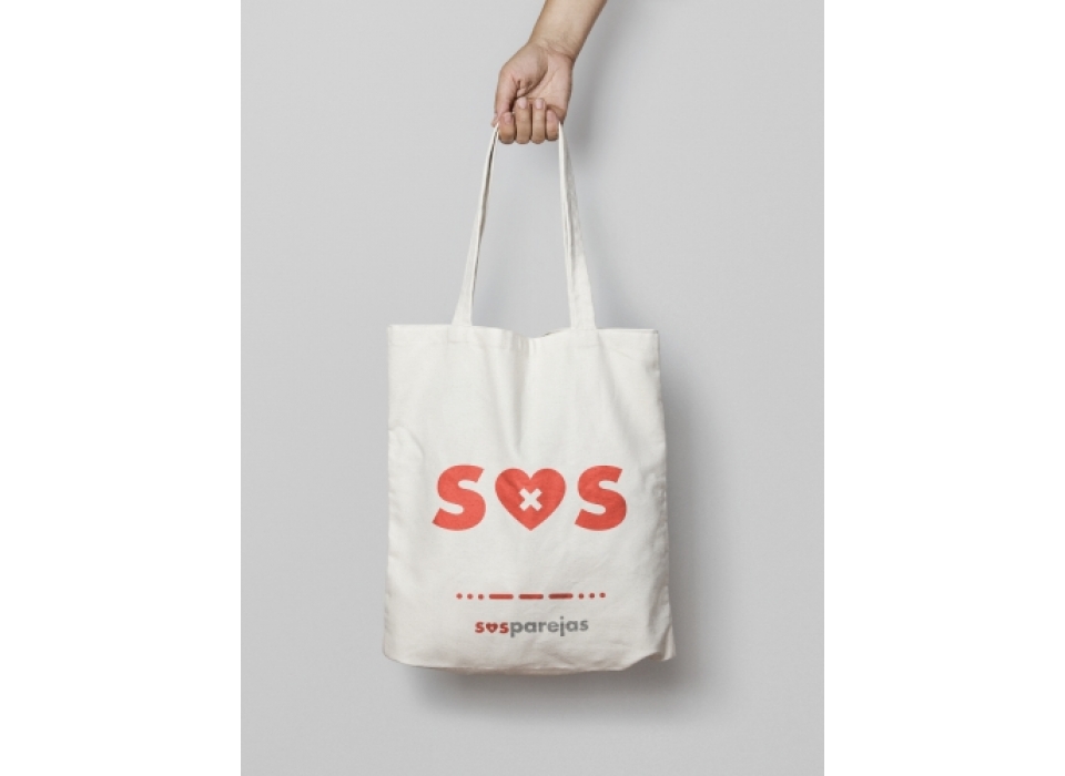
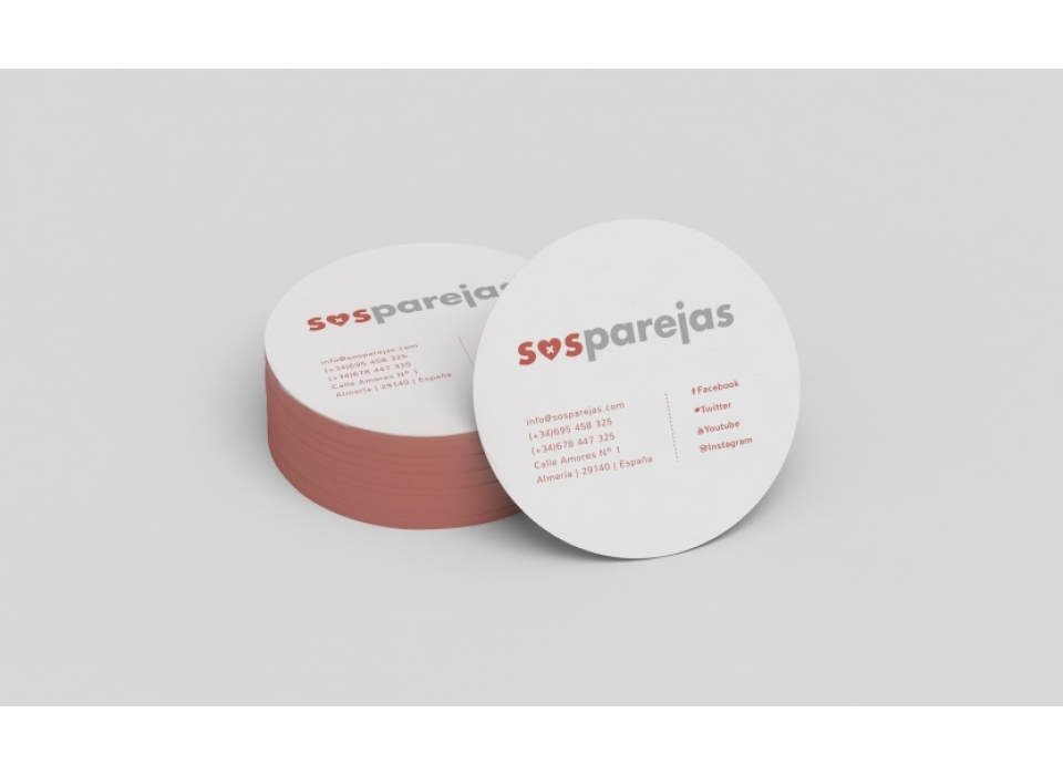
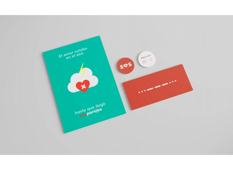
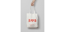
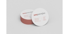
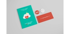
The main colour of the brand is red, the colour of love. By lowering the intensity we left a soft red, making it less stimulating and more comforting. An optimistic and daring colour. On the other hand, the white gives us a touch of contrast and balance.
The typeface chosen has been Gill Sans. With a jovial and carefree character, it gives the brand a friendly touch.
SOSparejas is a simple and direct naming, easy to read. It alludes to communicate and help, with its own identity creating a brand personality. It constitutes a corporate identity with a high visual retentiveness. The logo is an O turned into a heart that represents the couple's problem. In its reduced version, it has optimum visibility, both in terms of colour and visual identification. It has been possible to create a brand that defines itself perfectly.