


Description:
Nervion flooring. Construction warehouse specializing in: flooring, manholes, electrical conduits, drainage, supply, foundry registration, blocks, kerbs, granite, embankments/channels...
Objectives:
- Corporate Identity.
Results:
- Corporate Image.
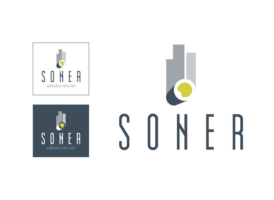
The design of the brand for the precast and flooring company SONER, represents and symbolizes the main ideas that are to be transmitted as quality, innovation, leadership... Composed of symbol and logo, the brand elegantly combines grey and lime yellow tones. For the composition of the symbol, it has been thought to highlight the products and services that the company develops, such as concrete piping and prefabricated products.
The textual part of the brand, the logo, uses an elongated and narrow typography, in capital letters, which further enhances the idea of growth and progress. It is characterized by straight and thick strokes, with elongated and symmetrical characters. For the version of the brand with the nickname'floor screeds
nerves", a second, shorter typeface has been used, with curved and fine lines, in lower case, which complements the main typeface while giving it elegance and simplicity.
The symbol represents products such as pipes and precast concrete products. Combining curved and straight shapes, it symbolises a large tube on which three elongated shapes stand like buildings. In a spatial way and in perspective, to give it volume and depth, the forms
curves represent a tube, illuminated inside, through which you can see and look at the straight shapes at the other end, architectural structures, buildings, shapes that rise up. This whole set also symbolizes the ideas of growth, advancement and trajectory of
improvement.