


Description:
Large manufacturer and distributor of concrete prefabricated, composed of 6 partners in the sector of companies with entity, with an investment of € 15M. Web and paper catalog also designed by Prodigia.
Goals:
-
Redesign corporate image. Project it on a first level website, which is a reference in the sector.
-
Before the product is on the market (6 months before April), the customer demands the product and has a digital and paper catalog to see the highest quality products in Spain.
-
Create expectation before the arrival of products to the market.
-
Brand positioning as a quality product in Spain
-
Image, idea or message to communicate: Product innovation. National leadership Factory of great entity and product quality. They will be present at all construction fairs. (create video of the web for the fairs)
-
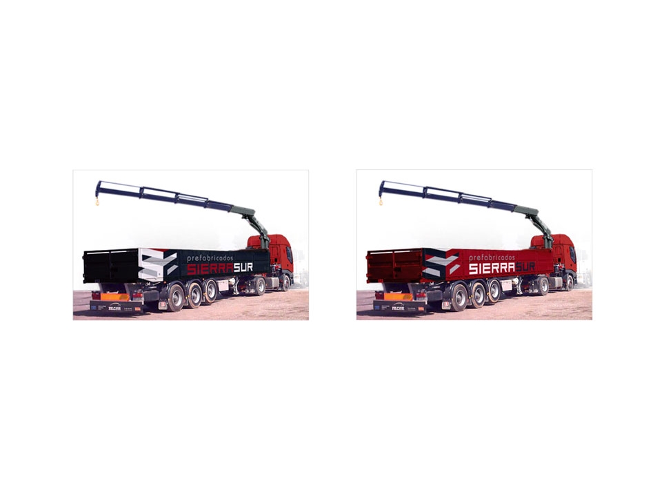
Integral design of product distribution trucks.
Results:
-
Benchmarking of Spanish and European competitors.
-
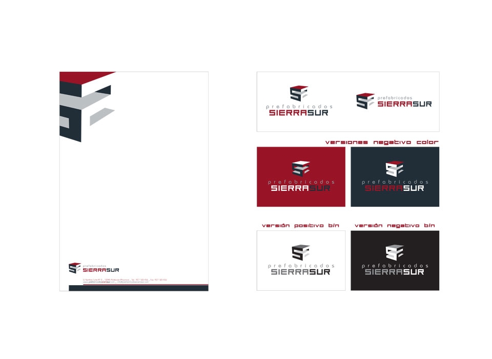
Identification Manual:
-
Logo: the textual part of the brand, is composed of two clearly different types. For the word "prefabricated" we have chosen a typeface of curved lines, of square height, modern and simple, that contrasts with the forms of the symbol. On the other hand, in the words "Sierra Sur", written continuously, differentiating them by color, a thicker typography with straight lines has been used, reminiscent of the symbol's forms. For these characteristics, the logo has easy readability, is quickly associated with the symbol and complements it.
-
-
Brand: The brand designed for the company "Prefabricados Sierra Sur" symbolizes the main ideas to be expressed, such as innovation, quality, entity ... Composed by symbol and logo, the brand combines the colors gray and red, with different patterns of the Gray. The symbol represents a volumetric form, in perspective, composed of the letter "S" repeated in two directions, making reference to the name of the "Sierra Sur" brand. Composed of straight lines, combined with different tones, so that they simulate a volume with contrasts of lights and shadows. It symbolizes what could be a product manufactured by the company, a piece of construction, decoration, a modern sculpture, an object that can not go unnoticed by its characteristics and easy to remember thanks to the association with the name of the company. The brand combines straight lines and curves, in a set that easily recalls the forms, images and materials used in the company. It combines colors that are quickly associated with the world of construction, the gray of concrete and the red that complements it and gives it visual impact, attention, etc. The brand as a whole fits perfectly with the image of the company, its activity, the construction sector and the ideas that are to be expressed.