Description:
Company dedicated to the manufacture of exterior pavements in all its possibilities, combining the different formats, textures, colors and thickness demanded by the market.
Goals:
-
Corporate identity.
Results:
Corporate image.
-
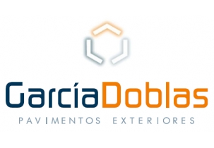
The brand designed for the pavement company García Doblas, represents and symbolizes the main ideas that the company wants to express as leadership, innovation, quality. Composed by symbol and logo, it combines the dark blue and orange colors.
-
The symbol is composed of three straight forms, in the form of a corner, aligned so that they form a hexagon inside, a form that is used a lot in the pavements and products that the company manufactures. Negative forms are drawn in white on the colors of the brand as lighting, playing in this way with the idea of empty, hollow, spaces that can be filled, being able to represent the intermediate spaces between the tiles. In this way, the idea of design and innovation in the manufacture of the company's products is also symbolized.
-
The textual part, the logo, consists of the words "García" and "Doblas" continuously, differentiating them by the colors and the use of uppercase and lowercase characters. The typography used stands out for its simplicity, elegance and originality, curved characters and thick lines, modern style that combines and compliments the symbol. A nickname has been added indicating the sector of the company, "exterior pavements". For this, a more straight typography and fine lines have been used, in a single shade of blue, which perfectly complements the brand.
-
Different versions of the brand have also been developed, depending on the reproduction of this in flat or process colors, thus, the brand with lighting effect or with colored lines will be used.