Description:
Hoi is a hotel franchise with technology facilities.
Identity Development:
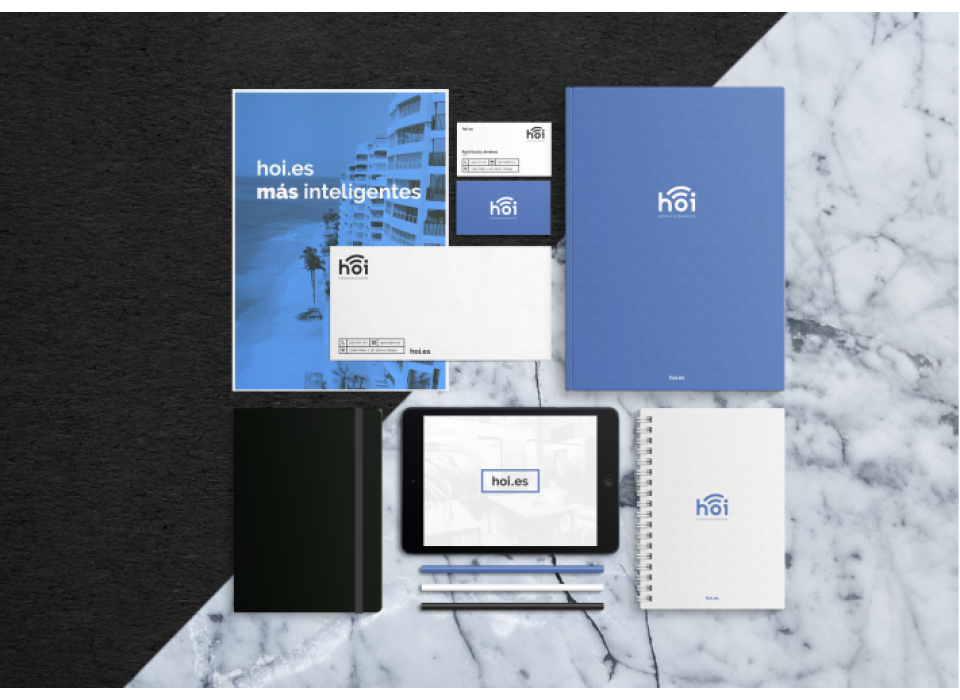
Hoi is a UNIQUE brand, with its own personality as its typography has been developed specifically for it. SIMPLE, as it is legible and easy to pronounce. FLEXIBLE, thanks to its extensibility and versatility in different fields. HIGH RETENTIVE, very compact. It also SYNTHETIZES a set of ideas and services that give meaning to the company.
The colour palette is striking in its simplicity, pure white and graphic are its main colours, the combination between them is a total contrast, as there is no greater contrast than that of white with black. To highlight we have an indigo blue colour,
a colour that is associated with the most intellectual part of the mind, as well as technological.
