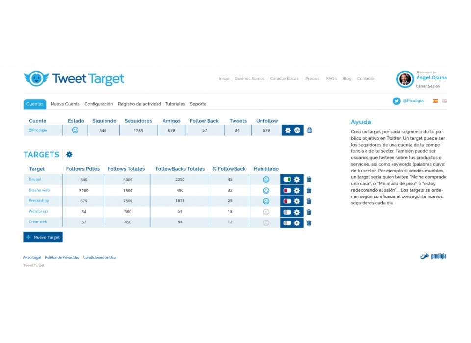
It is an application for the optimisation and management of twitter accounts with follower analysis and competitor benchmarking.
Objectives:
Naming and corporate identity design.
Outcome:
As a base, as it is an application only for twitter, it has been taken as a reference. Tweettarget is a descriptive naming whose root comes from the name given to the publications, Tweet. The typography used is neutral, modern and minimalist with a straight finish.
Psychologically, blue is a colour that is associated with tranquillity, calm, and gives the impression of authority, success, honesty and security. It is also influenced by the shade of blue: light blue produces an effect of calm, peace and freshness. That is why most social networks use this colour. For Tweettarget we have kept the colour of Twitter while introducing a darker blue for some details such as the visual reading of the naming.
It is an imagotype formed by a symbol, a bird. Worked from a frontal perspective and with a rounded shape, giving it a friendly look.
